A space for all.
Free Society
Branding
—
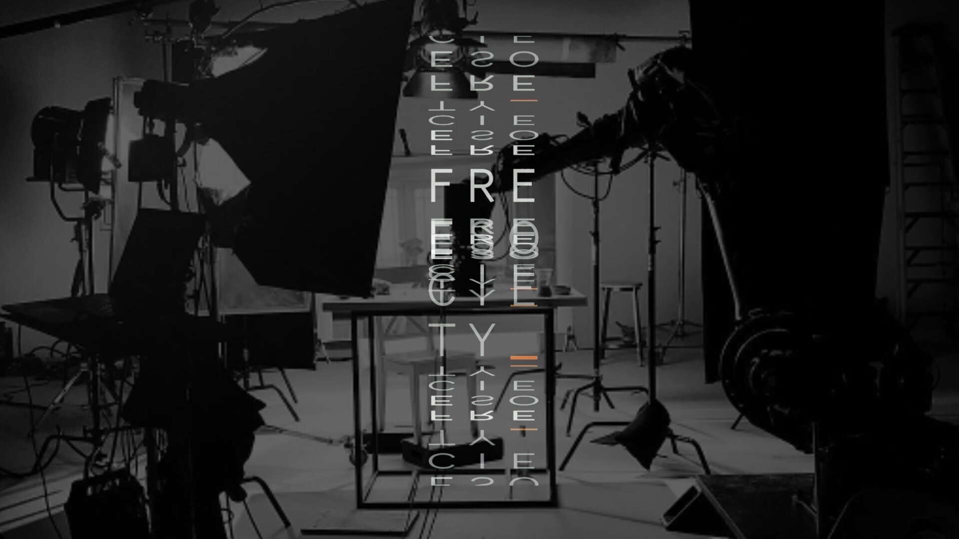
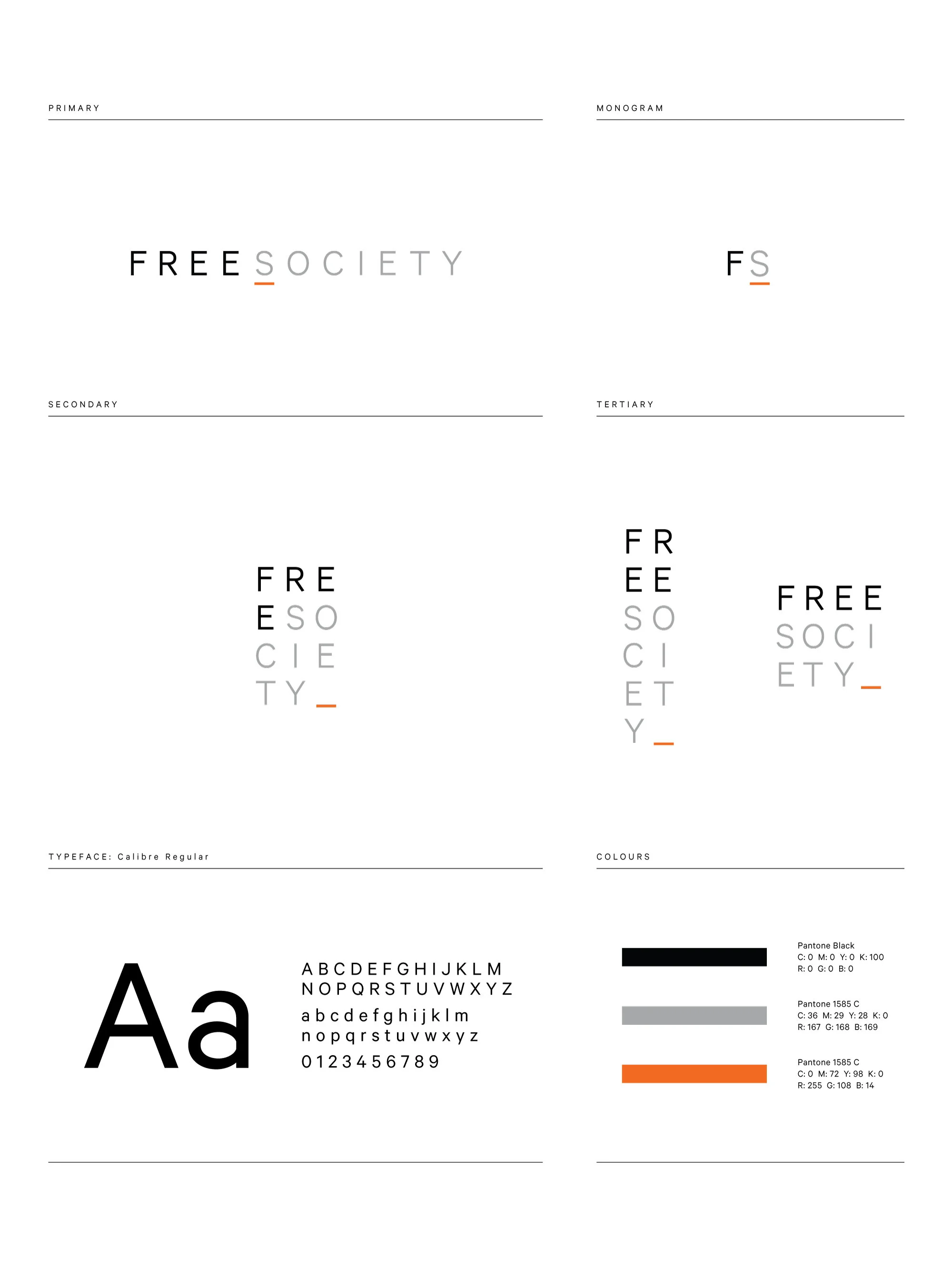
Shin Sugino was looking to evolve his studio, so we renamed and rebranded it to better capture the culture and spirit of his photographers. The studio itself is a modular space that can shift and change shape to suit production needs, and this is reflected in the typography: a logo that shifts and adapts to its surroundings, while always leaving a space just for you. The underlined “S” and the colour of the underline itself is a nod to the studio's past.
—
AD: EJ Jover | CW: Ross Pryde


